
Advibesor
Creating an app that helps people write better prompts to create more things
Introduction permalink
With much love ❤️ to all of you.
Over the last four years, I've been writing these case studies, trying to be very detailed and sharing useful terms and techniques. I've loved seeing what people have been creating with AI. It's been amazing. Coding is less required now, and the learning experience can be cooler and more personalized than ever.
But what is still needed to enable people who cannot code to operate at a technical level? They are often missing out simply because nobody showed them the basics. Unlock is a word AI likes to write, but here it feels right. People who never coded could unlock so much if they had the chance to learn the foundations. I think this is the last barrier in software creation for humans, and this is my contribution to help break it.
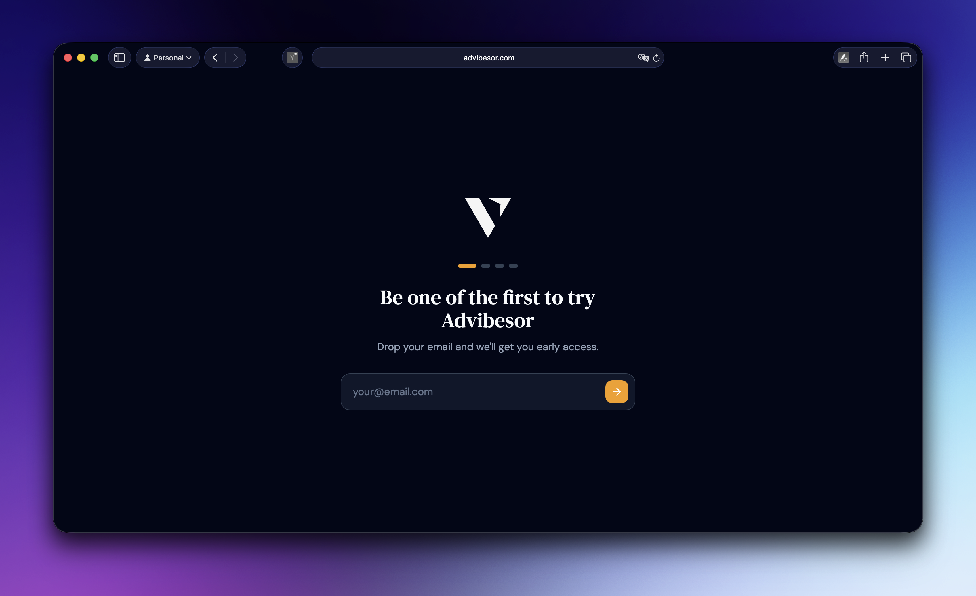
Introducing Advibesor.
What is Advibesor? permalink
Advibesor is an app that helps people master AI fundamentals. It has a TikTok-style learning experience that teaches core concepts through short, scrollable sessions. It also includes a news feed with summarized AI development news. And through MCP, it learns from your habits when you work in your IDE or CLI, so it can give you quick tips and reminders on how to create things better based on what you actually do.
Philosophy & UX permalink
I originally thought of Advibesor as a tool to improve prompts using human knowledge. The idea was simple: you type a prompt, and Advibesor helps you make it better before you use it in ChatGPT or Claude. The app had three pillars: a chat coach for refining prompts, a learning system, and a news feed.
But after seeing the impact that Skills are having in tools like Claude Code, I changed direction. Skills solve the prompt improvement problem well. They take expert knowledge and package it into formats you can reuse and share with anyone. If a skill already knows how to write a great marketing prompt, why would you need a separate coach? When I realized this, it felt like a weight lifted. I wasn't losing something. I was finding the right focus.
So I asked myself: what's the real problem left to solve? And I think it comes down to two things. First, a person needs to learn the right words. That means understanding the fundamentals of how AI works, what tokens are, what context means, and why your prompt structure matters. Second, a person needs to know which tools to use and when. That's it. I believe those are the last two problems to solve.
So I redesigned the app around that insight. Instead of a service that improves your prompts like an expert, Advibesor became a place to learn the fundamentals in a simple, engaging way. It felt right. The app finally had a clear reason to exist.
The app now has two pillars:
- Learn: A TikTok-style experience that teaches AI fundamentals through short, scrollable sessions that take about 4 minutes.
- News: A feed of tech news from Hacker News with summarized and rewritten titles for quick reading.
Advibesor also has direct MCP support. MCP stands for Model Context Protocol, and it's a way for AI tools like Claude Code to connect to outside sources of knowledge. What this means is that when you're working inside an AI tool, it can ask Advibesor for help. For example, if you're writing a prompt and you're not sure how to structure it, the AI tool can pull from Advibesor's learning content to give you better guidance. The knowledge doesn't stay locked inside the app. It flows into the tools you're already using. I really believe that people underestimate how powerful it is to have simple access to human knowledge. When learning becomes easier, we can all learn much more.
Psychology of Design permalink
Many of the design decisions in Advibesor come from how people naturally learn and pay attention. I spent time thinking about why certain apps keep you engaged and how I could use those same ideas for something that actually teaches you.
The TikTok format works because of low friction. When you open TikTok, you don't have to choose what to watch. Content just starts. I wanted the same thing for learning. When you open a session in Advibesor, questions just start. There's no menu to navigate, no course to pick, no setup. This removes the biggest barrier to learning: starting. In psychology, this is related to the concept of "activation energy." The less effort it takes to begin something, the more likely people are to do it. I noticed this in my own behavior. If an app asks me to make decisions before I can use it, I often close it. So I made sure Advibesor never does that.
Full-screen questions reduce cognitive load. When a question fills the entire screen, there's nothing else to distract you. You see one question, a few answer options, an image, and a short explanation. That's it. Research on cognitive load shows that people learn better when they don't have to filter out things that aren't relevant. By removing everything that isn't the current question, the brain can focus on understanding instead of navigating. It also makes the app feel calmer, which I think matters when you're trying to learn something new.
Images stop the scroll. The content hook at the top of each question is always an image, usually a meme related to the topic. This is based on the picture superiority effect: people remember images much better than text alone. But the image also serves a more practical purpose. On TikTok, the visual is what makes you stop scrolling. In Advibesor, a funny or relatable meme catches your eye and gives you a reason to pause and read the question below it. I liked how this felt when I tested it. It turns each swipe into a small moment of curiosity, and the memes make the learning feel less serious and more human.
Showing the "why" helps people remember. Instead of just telling users the right answer, Advibesor explains why the question is being asked and why the answer is correct. This is a technique called elaborative interrogation. When you understand the reason behind something, you're more likely to remember it later. It turns a quiz from a test into a learning moment. This was one of the changes I felt most confident about. It makes each question feel like a conversation, not an exam.
Short sessions respect attention spans. Each session takes about 4 minutes. This is intentional. Research on micro-learning shows that short, focused sessions lead to better memory than long study blocks. Four minutes is short enough that it doesn't feel like a commitment, but long enough to teach a few meaningful concepts. It fits into the small gaps in a person's day: waiting for coffee, riding the bus, taking a break between tasks.
Streaks and XP use commitment and loss aversion. I experienced this myself with Duolingo. When you have a 7-day streak going, you don't want to break it. That feeling is loss aversion: losing something you already have feels worse than not gaining something new. I wanted to bring that same pull into Advibesor. The XP system adds a sense of progress. Together, they create a gentle pull that brings people back to the app each day without feeling pushy or annoying.
Situational questions build real understanding. Instead of asking "What is a token?", Advibesor asks "The AI says your context window is full. What does this mean and what should you do?" This is based on context-dependent memory. When you learn something in a situation similar to where you'll actually use it, you remember it better. The quizzes simulate real moments people face when using AI tools, so the knowledge sticks when it matters.
Development permalink
SwiftUI and Modern iOS permalink
Advibesor is built in SwiftUI for iOS 17+. I chose SwiftUI because it lets me build and change things fast while keeping the app feeling native to iOS. For local storage, the app uses SwiftData, which works well with SwiftUI's way of watching for data changes and updating the screen.
For state management, I use Swift's @Observable macro. I create manager classes that hold important data, like whether the user is logged in or what their session looks like. When something changes in a manager, every screen that depends on that data updates on its own. I share these managers across the app using SwiftUI's .environment(), so any screen can access them without me having to pass things down manually.
For typography, I use DM Sans for body text and DM Serif Display for headings. I register the fonts at app launch using CoreText, and I created extensions so they work like Apple's built-in text styles. They also scale with the user's accessibility settings, so if someone makes their text bigger in their iPhone settings, Advibesor respects that.
For colors, I created custom definitions that change depending on light or dark mode. I didn't use Apple's default colors because I wanted more control over how the app feels. By picking my own shades, I can make it feel warmer or cooler depending on the section.
Learning System permalink
The Learn section teaches "vibe coding": how to build software with AI tools. The courses cover real tools that people use today:
- Foundations: What is vibe coding, setting up your environment, building your first app with AI assistance, understanding code that AI writes
- AI Tools: Cursor (Cmd+K, @mentions, Composer, Agent Mode, Background Agents, .cursor/rules), Claude Code (terminal commands, hooks, MCP servers), and other tools like GitHub Copilot, Aider, and Cline
- Build by Platform: Web development with React/Next.js, mobile with React Native and SwiftUI, backend with Node.js and Python
- Advanced Techniques: Prompt engineering, system prompts, .cursorrules and CLAUDE.md files, agent skills
The quizzes are situational. Instead of asking "What is a token?", they ask "The AI says your context window is full. What does this mean and what should you do?". Users learn terminology through real scenarios they will face.
Examples of what users learn:
- What to do when AI hallucinates a library that doesn't exist
- How to give better context using @mentions in Cursor
- When to use Cmd+K vs Composer vs Agent Mode
- How to recover when AI changes break your code
- What "technical debt" means and how to manage it
- The iteration loop: prompt, review, refine, ship
This matters because AI coding tools change fast. New features ship every week. Advibesor keeps users updated with the latest workflows and best practices.
Users progress through courses organized by levels, with quizzes in each level. Key features:
- XP System: Users earn points for correct answers.
- Streaks: Consecutive days of learning keep a streak going.
- Level Progression: Completing quizzes unlocks the next level.
- Course Selection: Users can switch between courses.
The quiz transition has a smooth animation where the selected quiz scales up before opening.
TikTok-Style Learning Interface
I used TikTok as the design reference and rebuilt the whole learning experience. The goal was to create a session that feels like scrolling through TikTok for about 4 minutes, but instead of entertainment, you're learning AI fundamentals. I was excited about this direction because it felt natural. People already spend time scrolling. Why not make that time count?
Each question takes the full screen height, and users swipe up or down to move to the next one. To build this, I use a vertical scroll view with no scroll indicators (so it looks clean, like TikTok) and a lazy stack of views inside it. Each question view is set to exactly the height of the screen. The key part is SwiftUI's scroll snapping behavior: I tell the scroll view to always align to the nearest full-screen page. This means that when you swipe, the view doesn't stop halfway between two questions. It always lands cleanly on one. This small detail makes the whole experience feel polished and intentional instead of loose and web-like.
The original design had floating action buttons on the right side (Why?, Insight, Share) that appeared over the content. I replaced those buttons with something more useful: contextual explanations. On the right side, you now see the why behind each question and the why behind each answer. This helps people understand not just what the right answer is, but why it matters. The caption area at the bottom shows a short explanation of the concept being taught.
The content hook is a meme or image related to the question. It's always visible at the top of the screen, and its job is to catch your attention and stop you from scrolling past. The visual style reminds me of the images I made for Animo.
When users complete a session, they can share their streak to Instagram Stories using a card generated with ImageRenderer. Haptic feedback triggers on answer selection using the .sensoryFeedback() modifier, giving the experience a tactile feel.
News Feed permalink
The News section helps users stay up-to-date with AI development news. It pulls from Hacker News and rewrites the titles into summaries for quick reading. A title like "Show HN: I built a new programming language" becomes "Try this new language for faster development".
The feed supports:
- Read/unread indicators
- Pull-to-refresh
- Search
- Offline reading tracker
- Fallback to raw Hacker News API when needed
Authentication and Onboarding permalink
Authentication uses Firebase with Apple Sign In and Google Sign In. The onboarding flow asks users about their experience level, programming background, and which AI tools they use.
Software Information permalink
- Project technology: SwiftUI, SwiftData, Firebase
- Industry: AI Education
- Work Duration: ~3 months
- Platform: iOS 17+
- Version: 1.0
Features permalink
- TikTok-style learning experience for AI fundamentals
- Contextual explanations for each question and answer
- Personalized share photos
- Tech news feed with summarized titles for quick reading
- Onboarding flow with user preferences
- Apple and Google Sign In
- Push notifications for learning reminders
- Light and dark mode
- Custom typography with DM Sans and DM Serif Display
Future Improvements permalink
I'm currently looking for my first users on Instagram to test the app. It's exciting and a little scary to put something out there, but I believe in what this app can do.
- Android version using React Native with Expo. The iOS app is built in SwiftUI, so this means building a second codebase. Expo makes this easier because it handles a lot of the native setup for you, like building for both platforms, managing app icons, splash screens, and permissions from a single project. The UI will be rebuilt using React Native components, but the backend and API stay the same. The goal is to reach Android users without having to rewrite the server side of things.
- Offline mode for courses and quizzes
- Widget for daily learning streaks